


本文演示了使用css3就可实现照片墙效果,主要使用了css3的transform属性,定义好照片的角度rotate和旋转基准点即可transform-origin:right bottom。更多jQuery照片墙DEMO演示:http://www.erdangjiade.com/search.html?keyword=%25E7%2585%25A7%25E7%2589%2587%25E5%25A2%2599
0、请不要问“在不在”之类的问题,有问题直接问!1、学生或暂时没有工作的童鞋,整站资源免费下载!2、¥9.9充值终身VIP会员,加我微信,826096331 拉你进VIP群学习!3、程序员加油,技术改变世界。在线 充值

照片墙.photowall代码
<div class="photowall">
<div class="photo02">
<div class="photoview" >
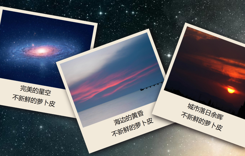
<img src="images/2.jpg" width="300" height="220">
<p>海边的黄昏</p>
<p><a href='http://www.erdangjiade.com/js/140.html' target='_blank'>Thinkphp+phpexcel导出和导入</a></p>
</div>
</div>
<div class="photo03">
<div class="photoview" >
<img src="images/3.jpg" width="300" height="220">
<p>城市落日余晖</p>
<p><a href='http://www.erdangjiade.com/js/44.html' target='_blank'>Flowplayer简单酷炫的视频播放器</a></p>
</div>
</div>
<div class="photo04">
<div class="photoview" >
<img src="images/4.jpg" width="300" height="220">
<p>大海的夜空</p>
<p><a href='http://www.erdangjiade.com/js/308.html' target='_blank'>jQuery模拟linux桌面</a></p>
</div>
</div>
</div>.photowall{
position: relative;
height: 100%; width: 100%;
display: -webkit-box; /*使用CSS3的盒模型之流式布局*/
display: -moz-box;
display: box;
-webkit-box-pack:center; /*定义盒模型内部元素在水平方向上居于中间位置*/
-moz-box-pack:center;
-o-box-pack:center;
-ms-box-pack:center;
box-pack:center;
-webkit-box-align:center; /*定义盒模型内部元素在垂直方向上居于中间位置*/
-moz-box-align:center;
-o-box-align:center;
-ms-box-align:center;
box-align:center;
}.photo01{
-weikit-transform-origin:right bottom; /*设置右下角为旋转基准点 */
-moz-transform-origin:right bottom;
-o-transform-origin:right bottom;
-ms-transform-origin:right bottom;
transform-origin:right bottom;
transform:rotate(10deg); /*以右下角为基准点顺时针旋转10°*/
-webkit-transform:rotate(10deg);
-moz-transform:rotate(10deg);
-o-transform:rotate(10deg);
-ms-transform:rotate(10deg);
}
.photo02{
-weikit-transform-origin:right bottom; /*设置右下角为旋转基准点 */
-moz-transform-origin:right bottom;
-o-transform-origin:right bottom;
-ms-transform-origin:right bottom;
transform-origin:right bottom;
transform:rotate(-20deg); /*以右下角为基准点逆时针旋转20°*/
-webkit-transform:rotate(-20deg);
-moz-transform:rotate(-20deg);
-o-transform:rotate(-20deg);
-ms-transform:rotate(-20deg);
}
友情提示:垃圾评论一律封号 加我微信:826096331拉你进VIP群学习群