


本文演示了项目中常用的三种不同加载动画,代码都很简单。
0、请不要问“在不在”之类的问题,有问题直接问!1、学生或暂时没有工作的童鞋,整站资源免费下载!2、¥9.9充值终身VIP会员,加我微信,826096331 拉你进VIP群学习!3、程序员加油,技术改变世界。在线 充值
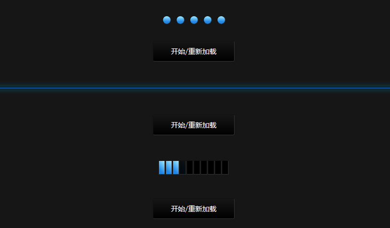

演示一:圆圈加载进度
<ul id="progress">
    <li><div id="layer1" class="ball"></div><div id="layer7" class="pulse"></div></li>
    <li><div id="layer2" class="ball"></div><div id="layer8" class="pulse"></div></li>
    <li><div id="layer3" class="ball"></div><div id="layer9" class="pulse"></div></li>
    <li><div id="layer4" class="ball"></div><div id="layer10" class="pulse"></div></li>
    <li><div id="layer5" class="ball"></div><div id="layer11" class="pulse"></div></li>
</ul>
ul#progress{
list-style:none;
width:125px;
margin:0 auto;
padding-top:50px;
padding-bottom:50px;
}
ul#progress li{
float:left;
position:relative;
width:15px;
height:15px;
border:1px solid #fff;
border-radius:50px;
margin-left:10px;
border-left:1px solid #111;border-top:1px solid #111;border-right:1px solid #333;border-bottom:1px solid #333;
background:#000;
}
ul#progress li:first-child{margin-left:0;}
.running .ball{
background-color:#2187e7;
background-image:-moz-linear-gradient(90deg, #2187e7 25%, #a0eaff);
background-image:-webkit-linear-gradient(90deg, #2187e7 25%, #a0eaff);
width:15px;
height:15px;
border-radius:50px;
-moz-transform:scale(0);
-webkit-transform:scale(0);
-moz-animation:loading 1s linear forwards;
-webkit-animation:loading 1s linear forwards;
}
.running .pulse{
width:15px;
height:15px;
border-radius:30px;
border:1px solid #00c6ff;
box-shadow:0 0 5px #00c6ff;
position:absolute;
top:-1px;
left:-1px;
-moz-transform:scale(0);
-webkit-transform:scale(0);
-webkit-animation:pulse 1s ease-out;
-moz-animation:pulse 1s ease-out;
}
#layer1{-moz-animation-delay:0.5s;-webkit-animation-delay:0.5s;}
#layer2{-moz-animation-delay:1s;-webkit-animation-delay:1s;}
#layer3{-moz-animation-delay:1.5s;-webkit-animation-delay:1.5s;}
#layer4{-moz-animation-delay:2s;-webkit-animation-delay:2s;}
#layer5{-moz-animation-delay:2.5s;-webkit-animation-delay:2.5s;}
#layer7{-moz-animation-delay:1.5s;-webkit-animation-delay:1.5s;}
#layer8{-moz-animation-delay:2s;-webkit-animation-delay:2s;}
#layer9{-moz-animation-delay:2.5s;-webkit-animation-delay:2.5s;}
#layer10{-moz-animation-delay:3s;-webkit-animation-delay:3s;}
#layer11{-moz-animation-delay:3.5s;-webkit-animation-delay:3.5s;}
@-moz-keyframes loading{
0%{-moz-transform:scale(0,0);}
100%{-moz-transform:scale(1,1);}
}
@-webkit-keyframes loading{
0%{-webkit-transform:scale(0,0);}
100%{-webkit-transform:scale(1,1);}
}
@-moz-keyframes pulse{
0% {-moz-transform:scale(0);opacity:0;}
10% {-moz-transform:scale(1);opacity:0.5;}
50% {-moz-transform:scale(1.75);opacity:0;}
100%{-moz-transform:scale(0);opacity:0;}
}
@-webkit-keyframes pulse{
0% {-webkit-transform:scale(0);opacity:0;}
10% {-webkit-transform:scale(1);opacity:0.5;}
50% {-webkit-transform:scale(1.75);opacity:0;}
100%{-webkit-transform:scale(0);opacity:0;}
}$('#progress').removeClass('running');
$('.trigger').click(function() {
$('#progress').removeClass('running').delay(10).queue(function(next) {
$(this).addClass('running');
next();
});
return false;
});演示二:网页进度加载
<div id="content">
      <span class="expand"></span>
</div>
$('#content').removeClass('fullwidth');
$('.triggerFull').click(function() {
$('#content').removeClass('fullwidth').delay(10).queue(function(next) {
$(this).addClass('fullwidth');
next();
});
return false;
});#content{
width:100%;
height:5px;
margin:50px auto;
background:#000;
}
.fullwidth .expand{
width:100%;
height:1px;
margin:2px 0;
background:#2187e7;
position:absolute;
box-shadow:0px 0px 10px 1px rgba(0,198,255,0.7);
-moz-animation:fullexpand 10s ease-out;
-webkit-animation:fullexpand 10s ease-out;
}
@-moz-keyframes fullexpand{
0%{width:0px;}
100%{ width:100%;}
}
@-webkit-keyframes fullexpand{
0%{width:0px;}
100%{ width:100%;}
}演示三:类似音量加载进度
<ul id="loadbar">
    <li><div id="layerFill1" class="bar"></div></li>
    <li><div id="layerFill2" class="bar"></div></li>
    <li><div id="layerFill3" class="bar"></div></li>
</ul>
ul#loadbar{
list-style:none;
width:140px;
margin:0 auto;
padding-top:50px;
padding-bottom:75px;
}
ul#loadbar li{
float:left;
position:relative;
width:11px;
height:26px;
margin-left:1px;
border-left:1px solid #111;border-top:1px solid #111;border-right:1px solid #333;border-bottom:1px solid #333;
background:#000;
}
ul#loadbar li:first-child{margin-left:0;}
.ins .bar{
background-color:#2187e7;
background-image:-moz-linear-gradient(45deg, #2187e7 25%, #a0eaff);
background-image:-webkit-linear-gradient(45deg, #2187e7 25%, #a0eaff);
width:11px;
height:26px;
opacity:0;
-webkit-animation:fill .5s linear forwards;
-moz-animation:fill .5s linear forwards;
}
#layerFill1{-moz-animation-delay:0.5s;-webkit-animation-delay:0.5s;}
#layerFill2{-moz-animation-delay:1s;-webkit-animation-delay:1s;}
#layerFill3{-moz-animation-delay:1.5s;-webkit-animation-delay:1.5s;}
#layerFill4{-moz-animation-delay:2s;-webkit-animation-delay:2s;}
#layerFill5{-moz-animation-delay:2.5s;-webkit-animation-delay:2.5s;}
#layerFill6{-moz-animation-delay:3s;-webkit-animation-delay:3s;}
#layerFill7{-moz-animation-delay:3.5s;-webkit-animation-delay:3.5s;}
#layerFill8{-moz-animation-delay:4s;-webkit-animation-delay:4s;}
#layerFill9{-moz-animation-delay:4.5s;-webkit-animation-delay:4.5s;}
#layerFill10{-moz-animation-delay:5s;-webkit-animation-delay:5s;}
@-moz-keyframes fill{
0%{ opacity:0;}
100%{ opacity:1;}
}
@-webkit-keyframes fill{
0%{ opacity:0;}
100%{ opacity:1;}
}$('#loadbar').removeClass('ins');
$('.triggerBar').click(function() {
$('#loadbar').removeClass('ins').delay(10).queue(function(next) {
$(this).addClass('ins');
next();
});
return false;
});
友情提示:垃圾评论一律封号 加我微信:826096331拉你进VIP群学习群